Guide to Qualifying New Suppliers in Malaysia for Manufacturing Success
Malaysia is a premier manufacturing hub in Southeast Asia. According to the Malaysian Investment Development Authority (MIDA), “Malaysia, with its extensive trade....
By AMREP | Posted on December 26, 2025
Statistical Process Control (SPC) is a fundamental element of modern quality management, enabling organizations to monitor, control, and improve processes through data-driven analysis. One of the most powerful and widely used tools within SPC is the control chart.
Control charts allow manufacturers and service providers to distinguish between normal process variation and signals that indicate potential issues requiring attention. When applied correctly, they help prevent defects, reduce waste, improve consistency, and support ongoing process improvement.
This blog offers a comprehensive guide to control charts in SPC, explaining what they are, the different types of control charts, the rules used to interpret them, and how to effectively read and act on control chart data.
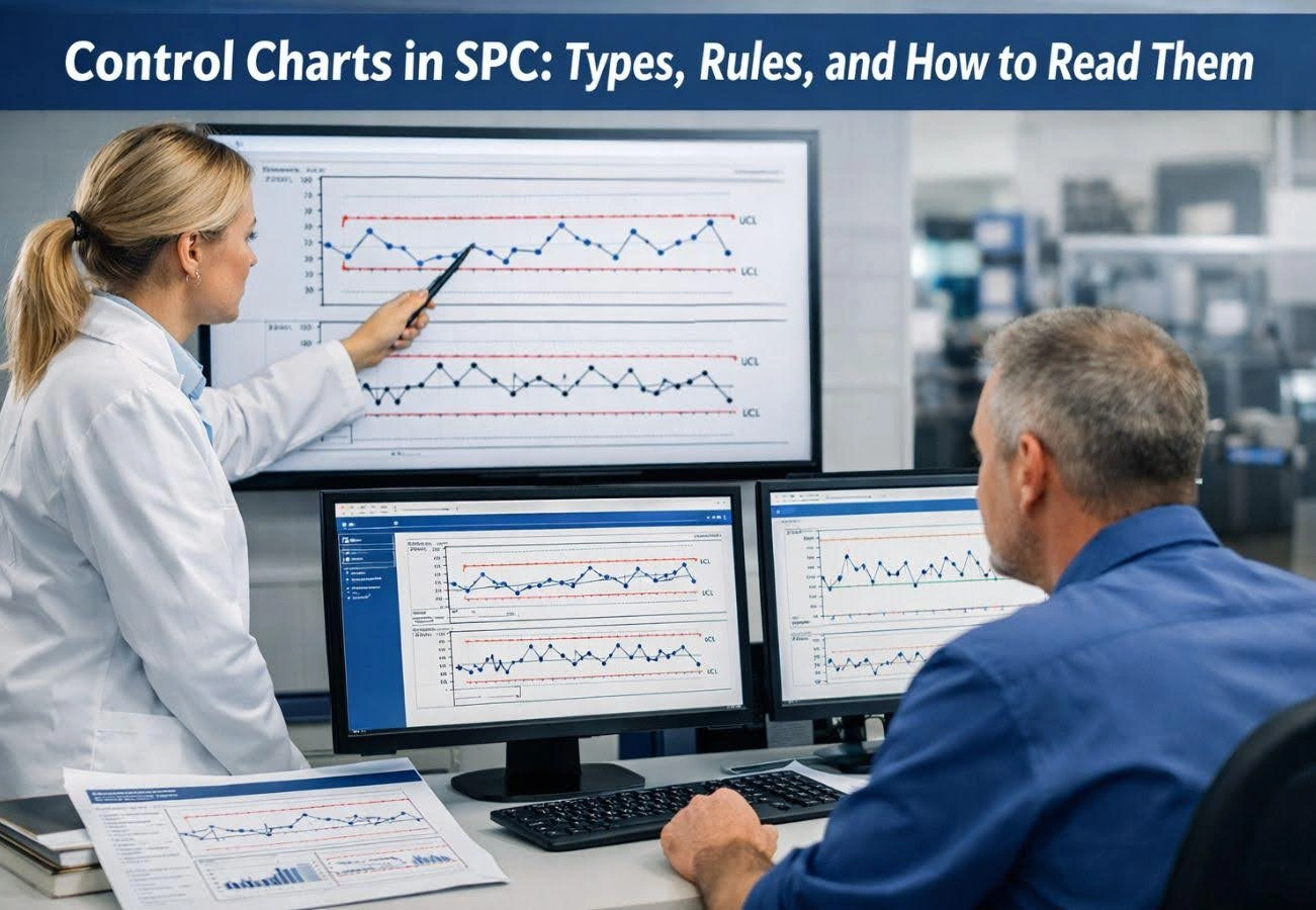
A control chart is a graphical tool used in Statistical Process Control to monitor how a process behaves over time. It plots process data in sequence and compares it against statistically calculated limits to determine whether the process is stable and predictable.
Control charts help answer two critical questions:
By answering these questions, control charts allow organizations to take corrective action before defects occur, rather than reacting after the fact.
Every control chart contains three essential elements:
The center line represents the process average (mean). It reflects the typical performance of the process when it is stable.
The upper control limit is the highest value the process is expected to reach under normal conditions. It is calculated statistically, not based on specifications.
The lower control limit is the lowest value the process is expected to reach under normal conditions.
The control limits are usually set at ±3 standard deviations (3σ) from the process mean, which captures approximately 99.73% of normal process variation.
It is important to note that control limits are not the same as specification limits. Specification limits are defined by customer or design requirements, while control limits are determined by process behavior.
Control charts play a vital role in quality and process management because they:
Without control charts, organizations often rely on assumptions or react too late to quality issues.
Understanding variation is fundamental to SPC.
Control charts are designed specifically to identify special cause variation.
Control charts are broadly divided into two categories:
The choice of chart depends on the type of data being collected.
Variable data are measurable on a continuous scale, such as length, weight, temperature, or time.
Purpose:
Used to monitor the process mean and variability when data are collected in subgroups.
When to Use:
How It Works:
Typical Applications:
Machining processes, dimensional measurements, and manufacturing operations.
Purpose:
Monitors process mean and variability using standard deviation instead of range.
When to Use:
Advantages:
Provides a better estimate of process variation than the R chart for large subgroups.
Purpose:
Used when data are collected one observation at a time.
When to Use:
How It Works:
Typical Applications:
Service processes, batch production, and laboratory measurements.
Attribute data are counted rather than measured. They indicate whether a defect exists or how many defects occur.
Purpose:
Monitors the proportion of defective units in a sample.
When to Use:
Typical Applications:
Final inspection results, supplier quality data, audit findings.
Purpose:
Tracks the number of defective units in each sample.
When to Use:
Purpose:
Monitors the number of defects per unit.
When to Use:
Typical Applications:
Surface defects, cosmetic flaws, documentation errors.
Purpose:
Tracks defects per unit when sample size varies.
When to Use:
Choosing the correct control chart depends on:
Using the wrong chart can lead to incorrect conclusions and poor decision-making.
Control charts are interpreted using control chart rules, also known as Western Electric or Nelson rules. These rules help identify patterns that indicate special cause variation.
A single data point outside the UCL or LCL signals an out-of-control condition and requires immediate investigation.
Typically, seven or more consecutive points above or below the center line indicate a process shift.
Six or more consecutive points steadily increasing or decreasing suggest a trend that may lead to instability.
Regular up-and-down patterns may indicate external influences such as shift changes, temperature cycles, or machine wear.
A noticeable increase or decrease in spread may signal a change in measurement system, materials, or operating conditions.
Environmental conditions can significantly impact product performance and reliability. For electronics manufacturers, our article [Thermal & Environmental Testing in Electronics: Standards, Methods & Best Practices] explores how temperature, humidity, and stress testing help validate product durability and compliance.
To read a control chart, first check the control limits and center line, then look for points or patterns that signal unusual variation.
Verify that all points fall within the control limits.
Identify trends, runs, or cycles that may indicate instability.
Use standard SPC rules to confirm whether special cause variation exists.
If a rule is violated, identify potential root causes such as equipment issues, operator changes, or environmental factors.
Remove the special cause and document the action taken.
Ensure the process returns to and remains in a state of statistical control.
A common mistake is confusing control limits with specification limits.
A process can be in control but still produce defects if it is not capable of meeting specifications. This is why control charts are often used alongside process capability analysis (Cpk and Ppk).
Avoiding these mistakes ensures control charts provide meaningful insights.
Control charts are foundational to methodologies such as:
They provide the data needed to verify improvements, sustain gains, and prevent regression.
Organizations that use control charts effectively experience:
Clear communication is critical when working with overseas manufacturers. Our article How to Set Expectations with New Overseas Suppliers outlines practical steps to align quality, timelines, and performance from the start.
Control charts are a critical component of Statistical Process Control, providing clear visibility into process performance and variation over time.
At AMREP, we understand that effective quality management starts with reliable data and accurate interpretation. Through our Quality Inspection Services, inspection audits, and process evaluation solutions, we help manufacturers implement SPC tools with confidence, identify sources of variation, and build stable, capable processes that consistently meet quality expectations.
By applying control charts as part of a structured SPC strategy, organizations can move beyond reactive problem-solving and achieve long-term operational excellence.
Contact Us To See What We Can Do
Call Us
Mon - Sat 9.00 - 18.00
Sunday Closed


12 - May 2025
12
May
2025
Malaysia is a premier manufacturing hub in Southeast Asia. According to the Malaysian Investment Development Authority (MIDA), “Malaysia, with its extensive trade....

22 - April 2025
22
April
2025
Healthcare is rapidly evolving, ensuring consistent and high-quality patient care. Total Quality Management (TQM) in healthcare is more than just a buzzword—it is a powerful....

16 - April 2025
16
April
2025
Total Quality Management (TQM) is a mindset that involves everyone in the organization working toward a common goal: achieving excellence through quality. From....


Our website uses cookies to improve your experience. Read our Cookie Policy for more information.